Turning On The Lamp
A research project investigating lighting at UAL and it's ramifications for the future of LCC
Role
Researcher and designer
Length
12 weeks
Type
Collaborative concept project
Key Skills
Prototyping, creative research,
Introduction
The beginning of any project always starts with the broadest questions, which was no different in the case of this particular course of work. I was assigned two areas to focus my attention on - the media block, and the library at the London College of Communication (LCC). I found the prospect of working in the library intriguing, as it was a space I was reasonable familiar with and frankly, it seemed mundane to me. Finding wonder in the mundane, however, is something that I believe I should be working to do as a UX designer. After all, simple improvements to seemingly meaningless things can often have the greatest impact on our everyday lives.
The first major decision made in this project regarded the specific aspect of the environment I would focus on understanding in my spaces. After exploring the communal spaces of the media block and the library, I came to ponder on a few themes, some more tangible than others. I considered delving further into the effects of aesthetic, lighting, and traffic, and the effects that they may have on academic performance and general focus. Ultimately, after careful deliberation, I decided that the best course of action would be to try to understand how we interact with lighting in these spaces in greater detail.
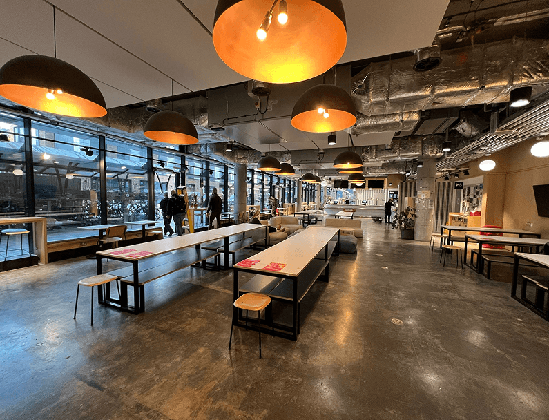
Location, location, location
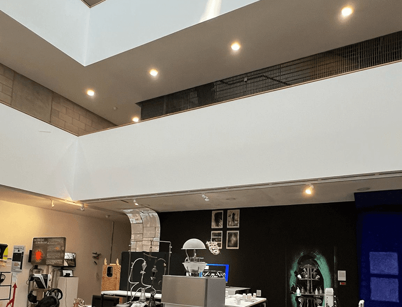
Above: the Atrium gallery in the Media Block
Mirror Images
The first pieces of research that I performed as part of this project were a sequence of auto-ethnographic studies conducted around various parts of the university. I focused on the Library at LCC, and I also explored the canteen at Camberwell College of Arts (CCA)

The upper section of the library at LCC
Camberwell College of Arts' canteen
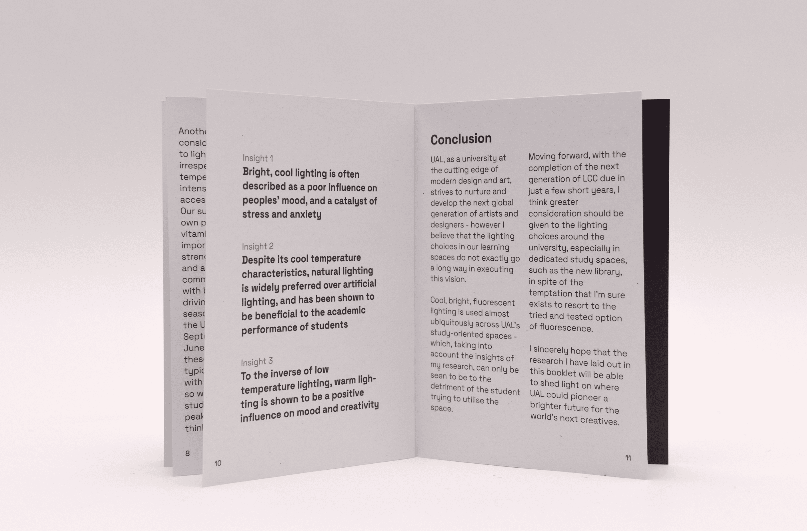
KEY INSIGHTS
1//
The fluorescent lighting in the LCC library made me feel comparatively more on edge compared to the softer lighting in the canteen at CCA
2//
People working on screens tended to congregate towards natural light sources - windows, skylights, etc.
3//
The temperature of the lighting seemed to dictate the use of the space. Warmer light tended to encourage more social and loose interactions, whereas cooler, artificial light seemed to discourage them
Paperwork
While working in the canteen, I came to wonder whether the tone of the light in a space had any effect on an individual’s productivity or creativity, so I used Google Scholar to see if I could find any studies which supported my ideas. As it happens, the effect of lighting on human behaviour is a very widely researched field, and I was able to find a large amount of papers which gave me some interesting insights into my questions.
A paper by Honrao (2024) provided me with some illuminating prospects, outlining that lower colour temperature (which, somewhat counter-intuitively, refers to warm light) could be seen to improve creativity in individuals, but on the other hand, higher temperature lighting installations could be seen in some cases to improve productivity. However, I was not particularly convinced by the depth of research presented by this specific paper, so I would have to find some more conclusive evidence later down the line to support my case.
“The need for more research is clearly indicated.” - Cmdr. Data, 1991
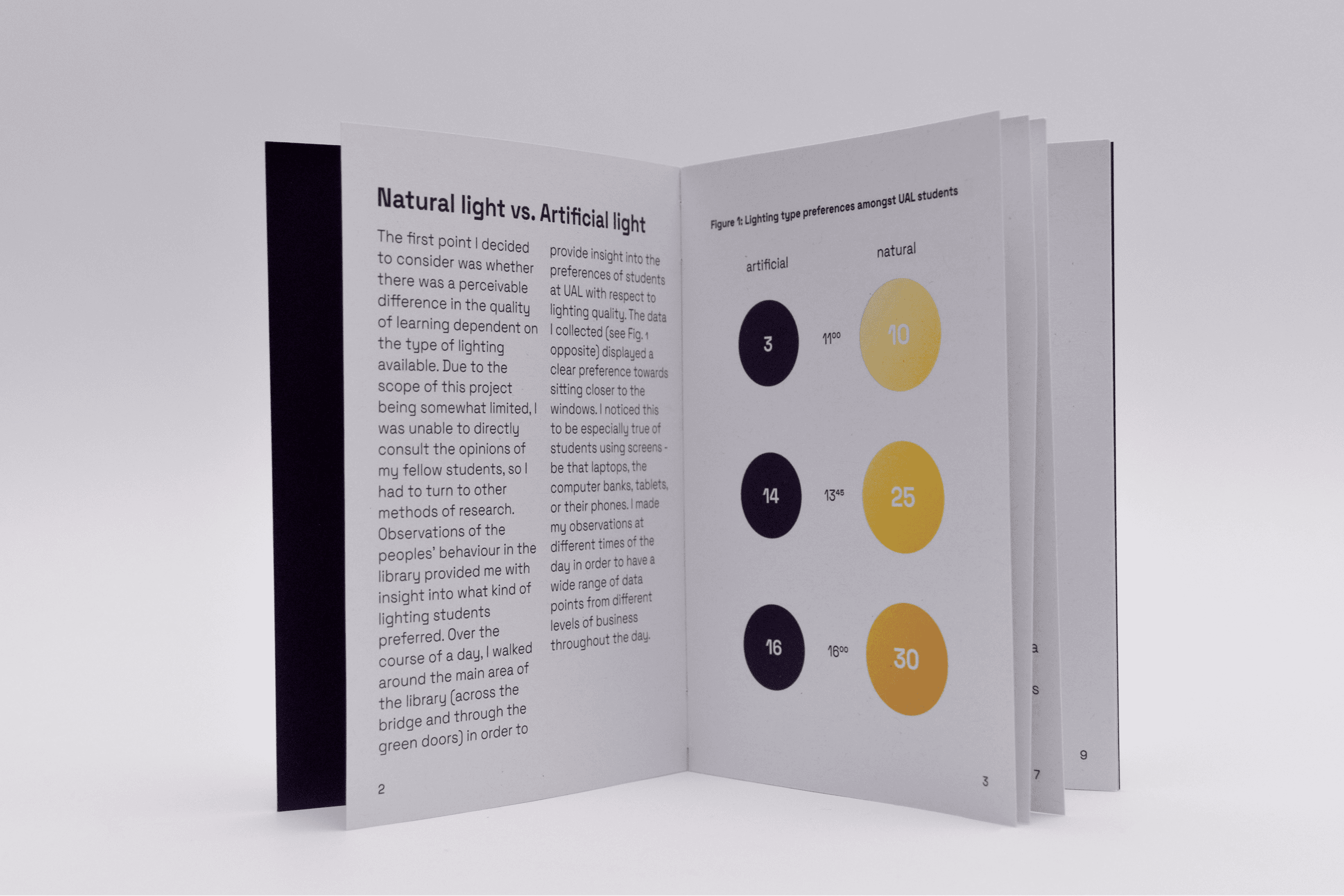
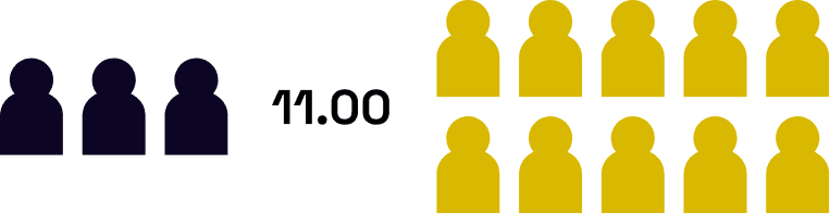
I set about collecting some hard, quantitative data points in order to support the idea that students preferred natural light to artificial light. I decided that a good data set that I could collect was counting the number of people sat next to the windows in the main section of the library, as opposed to the interior of the library, as I felt that this would provide me with a.) an excellent data set to either prove or disprove the aforementioned theory, and b.) some actual, numerical, presentable data! From 11.00 to 16.30 on a non-descript Tuesday, I wandered around the library, counting, at three different points of the day. The results were, honestly quite unsurprisingly, supportive of the notion. That evening, I worked on some initial designs for presenting the data:

Setting the Tone
Since the content of my artefact was going to be text heavy, I needed to find an appropriate typeface to employ in order to ensure clarity and legibility at a small size - the main body of my text would be 10pt. UAL’s branding consistently uses Helvetica Neue, with the exception of CSM, who use a dynamic typeface for some of their media. Bearing this in mind, I wanted to align with the branding of the university, but I was also seeking to appear more modern, emphasising my hope that the university could use my research findings to drive LCC into the next era. Since Helvetica is a neo-grotesque type, I wanted to remain within the movement, while also encapsulating the futuristic ideals I had for my designs. After careful consideration, my final choice of typeface would be Space Grotesk, a seemingly perfect fit for the criteria I had set out.
When choosing the colours to use in my artefact, I had to consider the same values that I sought to realise in my work through my typeface. In order to stick with the ‘neo-UAL’ idea that I had aimed at when choosing to use Space Gro-tesk, I aimed for simplicity and conciseness. The colours I chose can be seen on the right. I chose Brand as a simple off-black which provided enough contrast for proper legibility. Mann, a pure white would not need any ink to print, minimising waste. I chose Edmunds as an accent colour. A perfect red, for its sharp contrast and sense of urgency - whereas Miller was chosen for the opposite reason: it was subtle, but different enough to show up in print as the representation of a midnight blue tone I wanted to represent.
Brand
#1A1A1A
Mann
#FFFFFF
Edmunds
#FF0000
Miller
#0C0524
The Finished Product
Finally, after completing the design work of the booklet, the time came to put ink to paper and produce the artefact. I chose to use recycled paper for the entire artefact, as I believe it is always worth reducing waste where possible. After cutting down trees for a living for a short time in 2024, it’s about time I saved a couple instead. The cover is printed on 250 gsm recycled paper, and the inner pages are printed on 150 gsm recycled paper. The booklet was saddle stitched.