

What is the Gorilla Experiment Builder?
Gorilla.sc's flagship product is a web-based SaaS product primarily used by academic researchers to design and recruit participants for psychological research tasks. It's used by over 30,000 researchers across over 1000 universities.


Understanding the Problem
We reviewed 213 support tickets and conducted 14 usability tests - comprising of a couple of tasks using the existing product, and a SUS survey - with current users on the original site. Our findings highlighted some serious usability flaws with the product:
SYSTEM USABILITY SCORE: 20.4/100


Problem Framing and Ideation
I created a persona to frame the issues at hand, defined a problem statement, took part in a design studio with the clients, and created a prioritisation matrix to help us manage our short time on the project effectively:

“”
Jasmine needs to build and deploy experiments as quickly as possible so that she can begin collecting data for her research, however the builder navigation is unintuitive and stressful to use, causing Jasmine to spend too much time learning functionality and not enough time designing new experiments.


Mid-Fi
I created a MidFi prototype using Figma to test usability and experiment with layout ideas:
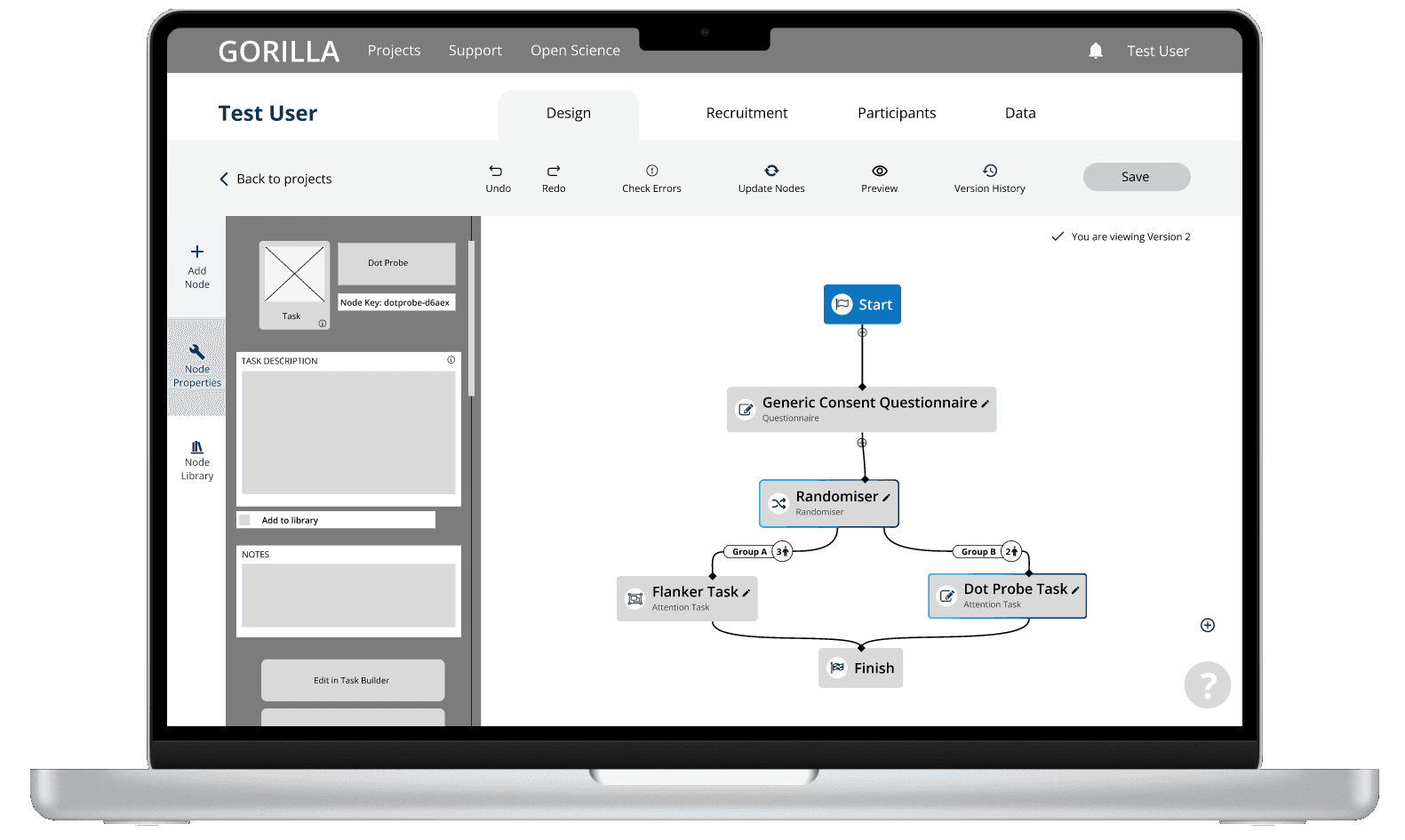
We aimed for the UI to feel more familiar to many users, and therefore more intuitive and easy to learn. The introduction of F-pattern precedents, a split pane design, and fresher, clearer iconography were major factors in this.
Onboarding flows were designed to walk the user through a lot of common tasks they would complete in the Experiment Builder.


Adding easy access to a searchable help panel allowed users to more easily access the Experiment Builder's documentation.
Testing, 1, 2…
In order to validate success, I conducted more usability testing and collected more SUS data to gather fresh insights:
01//
Users preferred the new split pane layout, describing it as “really easy to use”

02//
Users found the side panel to be useful, but its layout proved to be its hubris
03//
New users were still confused by the concept of nodes, despite attempts to explain their functionality through onboarding
04//
Users (mostly existing) were frustrated that they were forced to complete the entirety of the onboarding flow before starting to create a new experiment
NEW SYSTEM USABILITY SCORE: 75/100
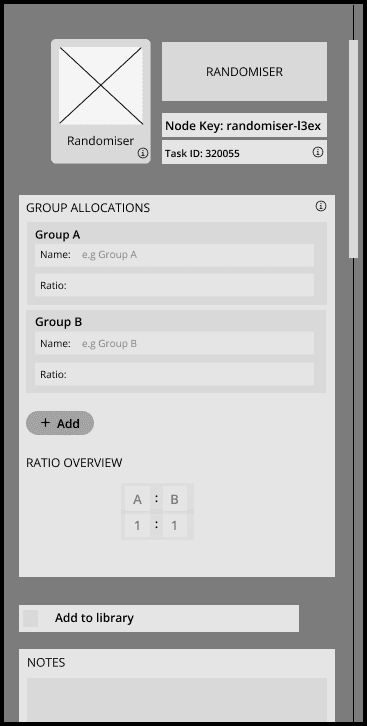
Iterations
Iterations
Using the insights gained from our testing, we created another round of mid-fi prototypes which addressed the concerns our users faced with our earlier version:
Restructuring the side panel made it more visually pleasing and allowed the users to digest its content more easily.


Greying out areas irrelevant to the current step and allowing users the option to exit allowed for far better comprehension of the onboarding flow.
Rewriting the copy for the onboarding flow allowed the users to digest each stage of the process more easily and led to better understanding of the Experiment Builder.

Colouring In!
In order to make the final prototype as cohesive and consistent as possible, I led the team in creating a component-based design system and refreshing the colour scheme by adding grades to some of the existing brand colours.


