
The Big Bad Brief
The premise of the brief was to ‘investigate an everyday interaction’ and reimagine it, thinking about the affordances and signifiers of things we interact with in everyday life. The open-endedness of the brief allowed for a lot of freedom as to what we could investigate and work towards.
Discovering the Project Space
As a group, we conducted observations in various spaces around London, thinking about waiting in public spaces. Some observations were conducted in a public park, various segments of the London Underground, and in Paddington station.
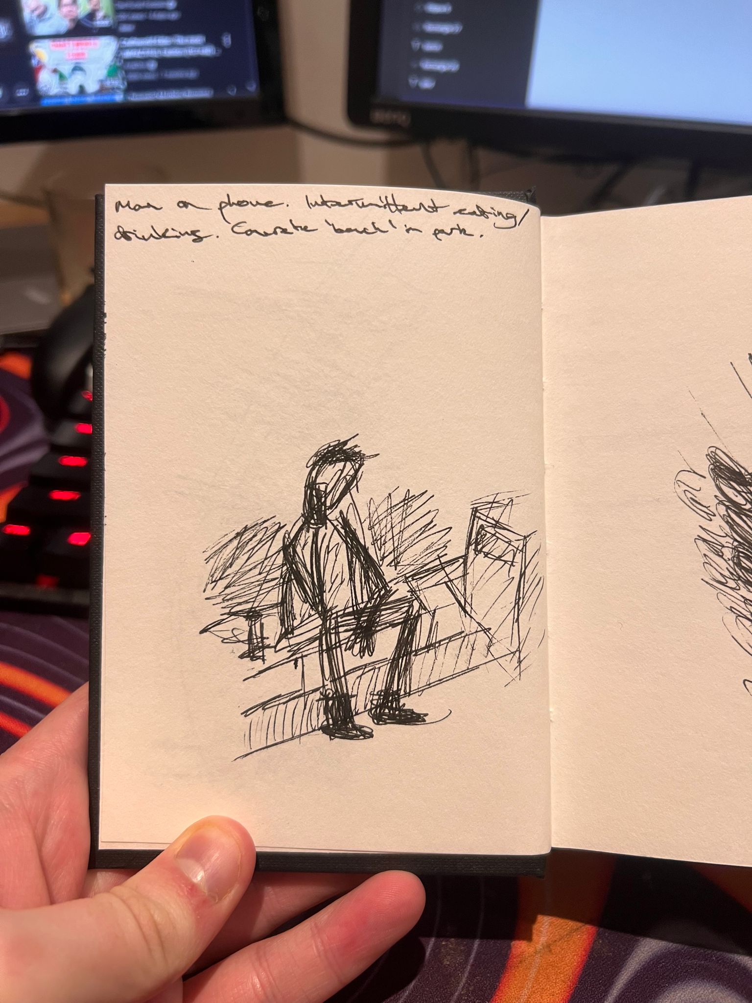

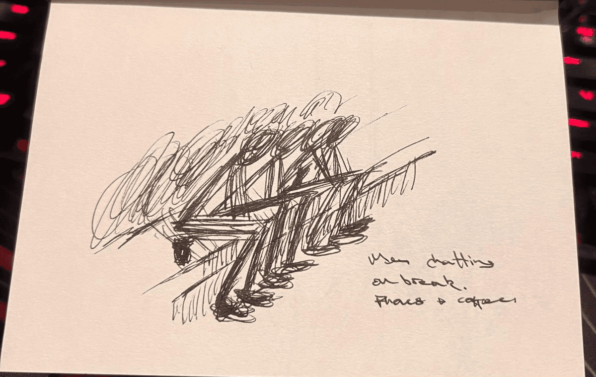
The main takeaway was that no matter the space people were observed to be waiting in, it was apparent that digital content of various shapes and forms has a near-total monopoly on our attention in these scenarios. This led to our primary research question:

Early Ideation
With our research question in mind, we considered themes including rematerialization, playfulness, and interactivity. Bodystorming would allow us to better understand potential moments of friction in the waiting experience on a platform, so I created a fake tube platform to allow us to experiment.
As well as this, I drew some "Crazy 8" ideas, using a compressed timeframe to push myself to be creative and come up with novel ideas. As a group, we voted on ideas we found interesting (denoted by the stars) and discussed developing them further.


Left: My Crazy 8s!
Right: A mockup of a tube station quickly constructed from masking tape and paper to facilitate our bodystorming exercise
Getting the Weirdness Out
As a team, we all individually came up with very different prototypes, across a variety of media. My prototype was a low-fidelity mockup of a Tamagotchi-esque app. Ideally, I would have liked it to be standalone - a portable console of sorts - but I decided to design the initial idea for a smartphone layout, to test how the concept might have been received through a more familiar medium.
My colleagues designed some really interesting things, including a ring wearable which would provide tactile stimulation while walking around Tube stations, an interactive treasure hunt app, and a mockup of a zoetrope tunnel video.

Above: Screen flow: Splash screen, Log in/register page, hatching a "tomodatchi", customisation, home page with stats, bluetooth "find a friend"
Testing Insights
Testing is crucial. So test we did! For my initial prototypes, I asked two students for their initial impressions as to what my prototype might have been, and what it might do, and how that made them feel.
We presented our findings in a tabletop presentation and received some feedback which was generally receptive of the work we had completed as a group and opened some interesting avenues for further research into playfulness, and allowed us to hone in further on what we wanted to develop further.
The Good:
The login screen was successful
The customisation screen was successful - “I like that, it makes me more invested”
The Bad:
On a whole, the purpose of the final screen was not clear, other than the bluetooth logo
The Ugly:
People generally understood that the first screen was a splash screen. One user wished it was more simple
The third screen was mostly well received, but people found it somewhat confusing
The fifth screen was understood by one user but not the other. I anticipate this may have been due to my ~sub-par~ sketching
Key Insights:
It was clear what the app was supposed to do. The affordances of each screen were generally clear, with room for improvement in places
People liked the concept! It seemed fun to them.
Prototype Evaluations
After our first round of testing, we came together as a group and discussed how we felt about the prototypes:
I gave myself my flowers first - I, and my groupmates, liked the ‘mascot’ aspect of my ‘TfL Tomodatchi’ idea. We thought that it was a fun way to make the Tube feel more personal, although we did think that as a design solution it would definitely be a bit of a cheap and lacklustre prospect. However, I thought that it could be a good tool to tie together a narrative idea later down the line, if we needed to. It could also have tied into the ‘fun cars’ idea that Zoe had put forward, too.
The ‘fun cars’ did worry me a bit - in terms of accessibility, and even health and safety. The idea of a squishy floor or monkey bars in the carriage seemed like a disaster waiting to happen, and would be a potential nightmare for elderly passengers. As well as this, I found the idea of making things childlike and playful for the sake of it to be really corny, and for lack of a better word, immature. I made clear to the group that I wanted to move forward in a more considered manner.
When it came to the zoetropes, I really liked the idea but I had some concerns about the feasibility, as the tunnels on the Tube are very narrow, with the one exception being the Elizabeth line. I also thought that they could be a bit overstimulating, especially in the loud, busy, environment of an underground train
I really appreciated the interactivity that the treasure hunt provided - it seemed really fun, though it being an app was a definite drawback. It prompted me to share my idea of having a screen on which you could play tic-tac-toe with a friend or a stranger, which was the springboard for the group thinking more about games, and ultimately choosing to design our ‘Pong’ game.
Pre-Pong
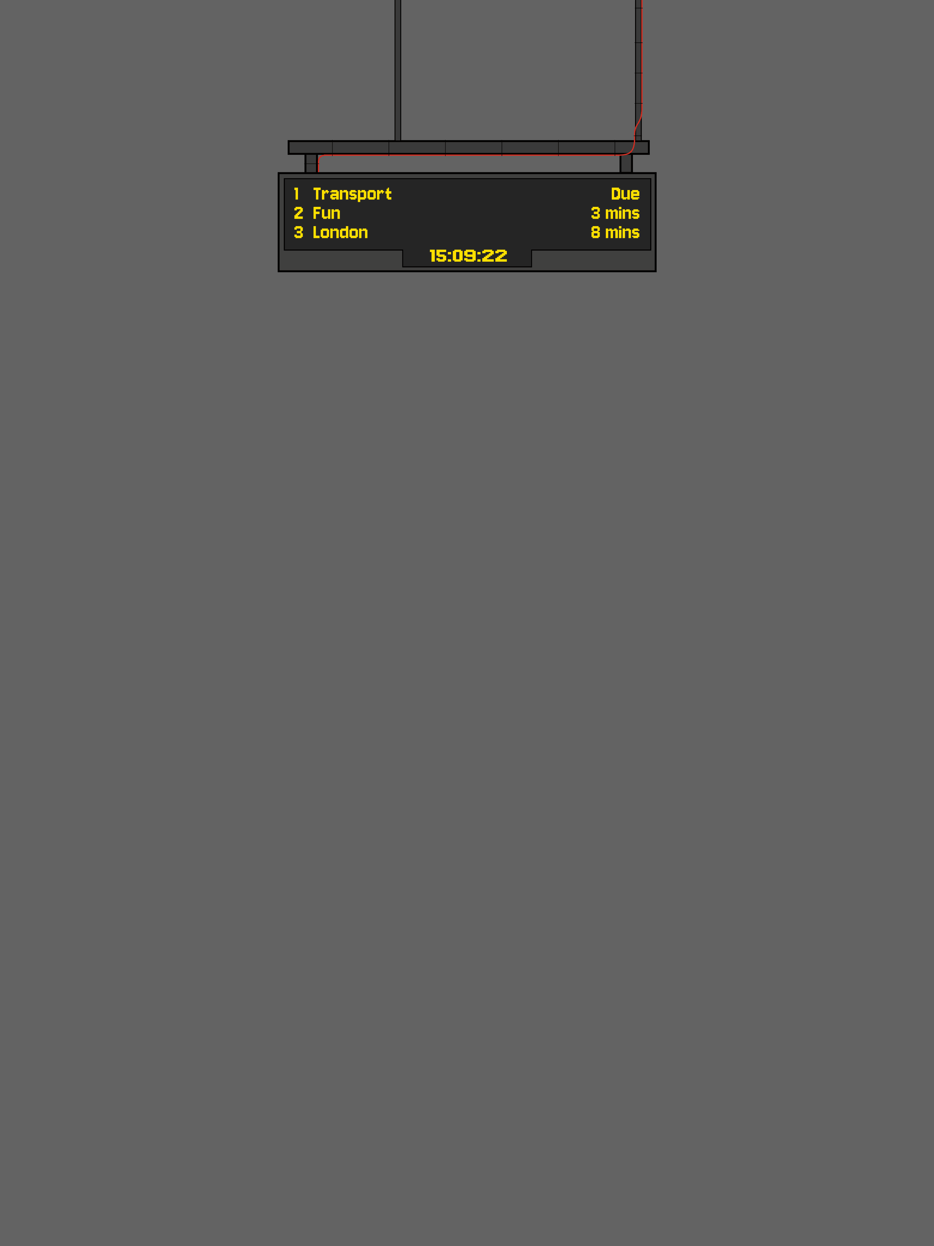
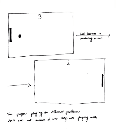
One of my initial sketches detailed a replacement for an advertisement board which would allow commuters to play games like tic-tac-toe, word search, and possibly other games too. I had thought about Snake, and Pong as options. It would have LEDs around the back of the screen which could diffuse off the walls and add a greater ambiance to the games board too - similar to the arcade games of yesteryear.


Testing, one, two…
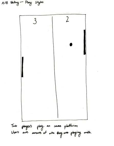
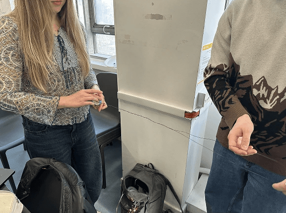
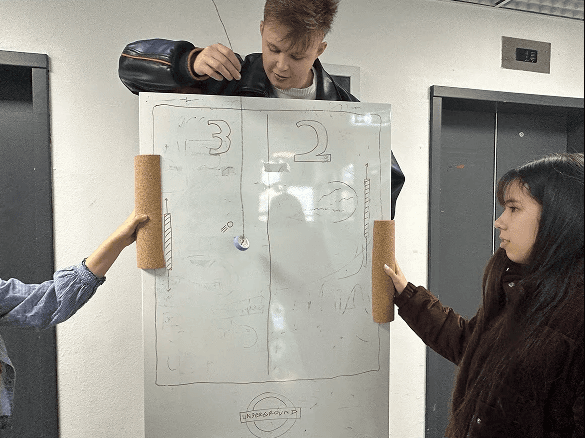
We tested our first prototype with our colleagues, as well as doing some guerilla testing in UAL's library. We asked two participants (four total) to play the game against each other, to make sure that our design was discoverable and afforded the users what they needed to play Pong. We simulated the ball using a Lego wheel attached to some metal wire which I controlled with my hand.
Testing was generally successful, and we were able to gather some valuable insights: not everyone was open to playing with strangers, people wanted it to stick out more visually; people wanted it to be more ‘Tube-specific’.


Designing the Assets
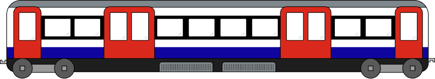
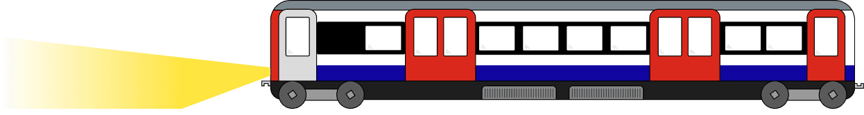
The assets I designed were meant to represent the Underground trains in a simplified yet accurate manner. This way they would be visually pleasing but wouldn’t distract too much user attention from the ball. I think that the somewhat minimal representation of the trains also helps with the retro vibe I wanted to go for with the design of the game as a whole, as I feel that pong, as a classical example of a video game, is often associated with retro arcades.
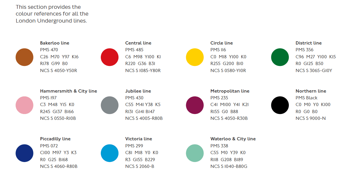
I used TfL’s official brand guidelines to choose the colour palette - excluding the grayscale tones. I used the TfL roundel as the ball design, as well.
My main contribution to the final prototype was designing the “screen” in the form of a poster. I am fairly happy with how it turned out, though I think there are a few things that I could have added to enhance the experience, such as printing the train cars separately and attaching them to the handles somehow, so that they would move up and down when the users moved the handles. The print itself was on A1 matte stock, which I chose because I thought that glossy would not have represented a touchscreen as well as matte would have. While I contributed to the ideation of the handles, I did not have any part in the modelling or printing of them.
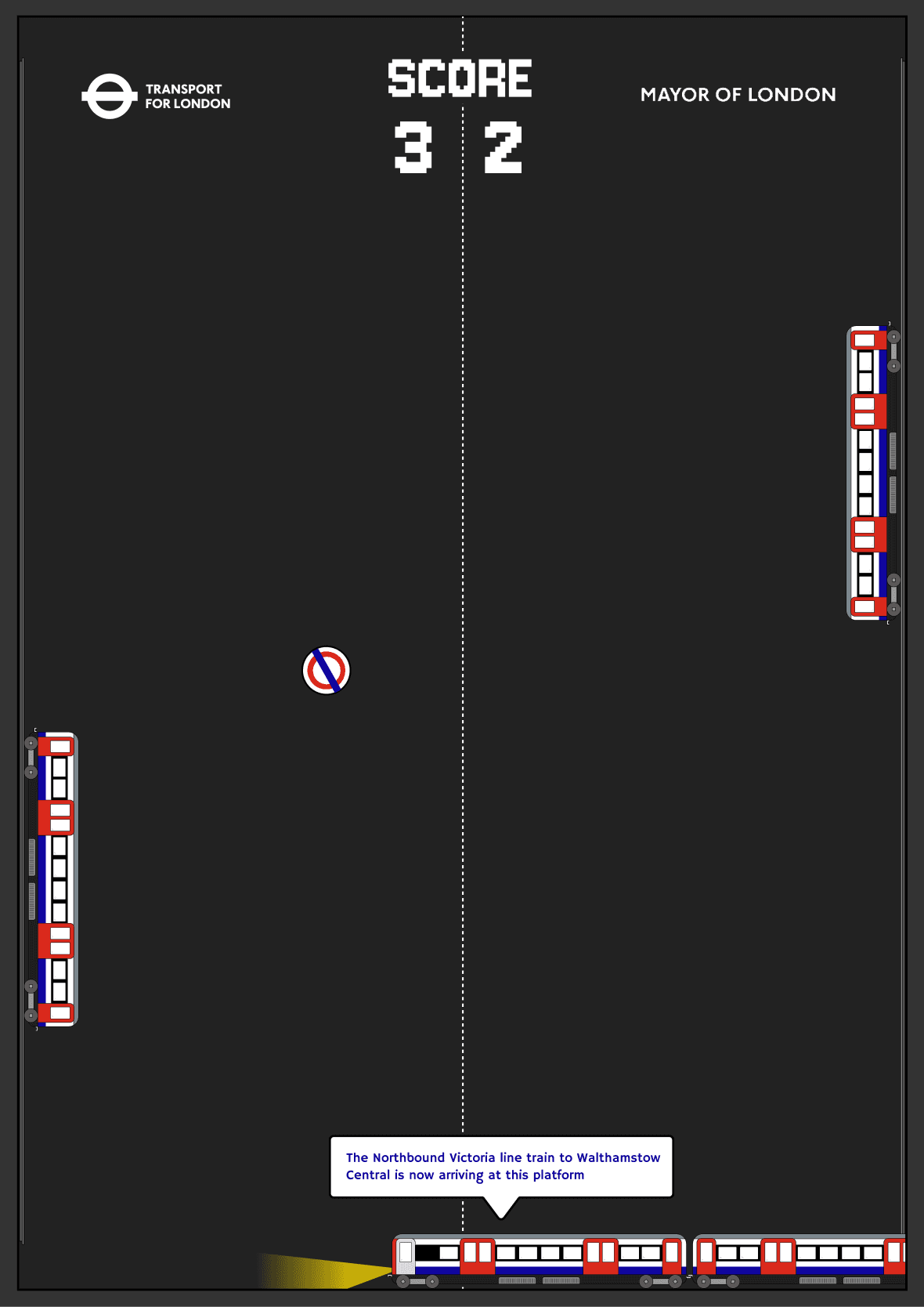
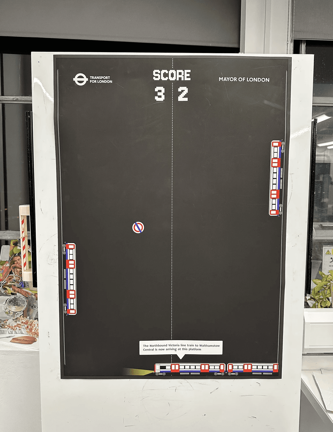

Left: The design for the poster. Middle: The final mockup, complete with handles. Right: A mockup of the design situated in Bank Underground station.
Aesthetic Choices
I decided to use Hammersmith One, inspired by the proprietary Johnston typeface which is used across the TfL network, as it is quite visually similar. It is a humanist, sans-serif typeface which affords great legibility, with the exception of the capital I, and the number 1 being essentially the same character. For the “retro font”, I have used Jersey 10.
As I mentioned earlier, I used colours from TfL’s official reference, as I wanted to frame myself as if I were actually designing the screens for TfL.
Reflection
This project was a success for me. I really enjoyed the focus on making things in the physical domain and I think that I definitely matured as a designer through this process. I’m happy with how I refined my observation skills early on in the project, and I’m especially proud of how I improved my collaborative skills throughout the project. I think that working with Annika and Zoe specifically was interesting, as they were exchange students from different (non-UX) courses, and their unique perspectives were fascinating to hear throughout the project. I also learned a lot from their relentless work ethics.
One of my favourite parts of this project was doing the guerilla testing in the library with the physical whiteboard prototype. I think from a UX perspective it was much more insightful having people interact with a physical object and being there with them during the test. It was much easier to see how people were feeling while they undertook the test and find the pain points with our product.
Overall I think that the project was successful. I think that our Pong board met the criteria that we set ourselves, inasmuch as it would get people off their phones while commuting. Although it technically didn’t meet the specification of our main design question as it is still a digital construction at its’ heart, I think that the spirit of the question is still embodied in the project itself.
